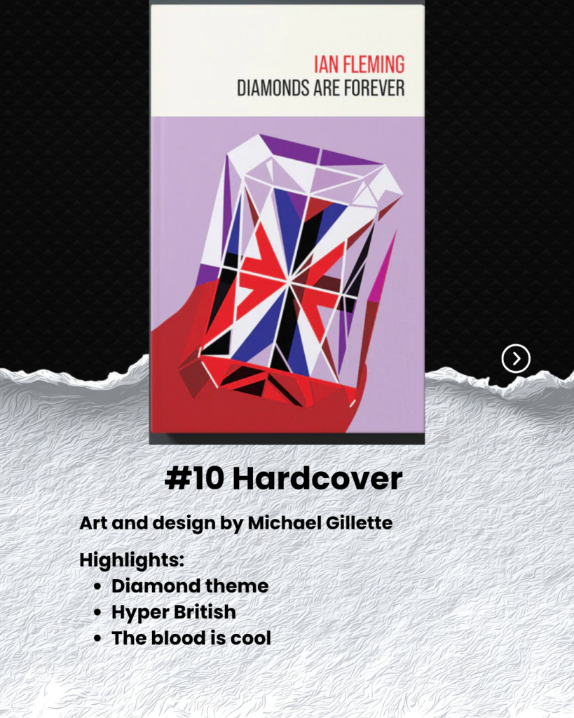
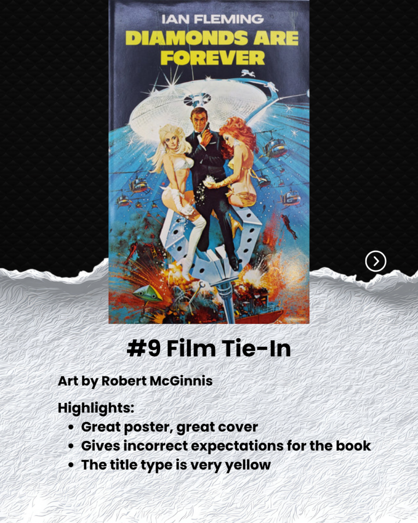
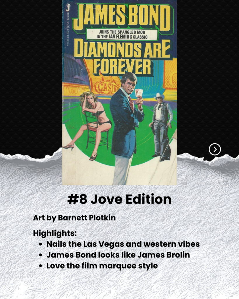
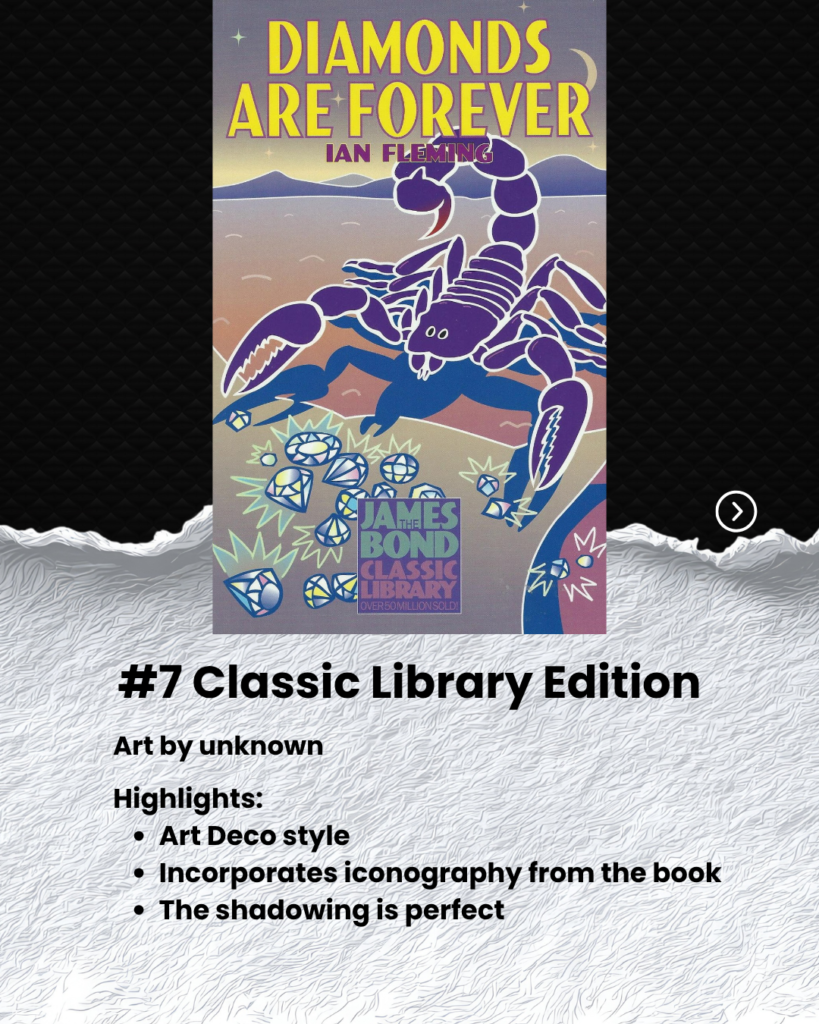
To celebrate the 70th anniversary of the publishing of Diamonds are Forever, I’ve put together my own retrospective review of my top 10 cover choices. At the bottom, I’ve also included quick commentary about my least favorite covers I’ve found.
Dishonorable Mentions
Here are the covers I not only dislike, but I despise. They are not great, but bad enough worth my discussion.

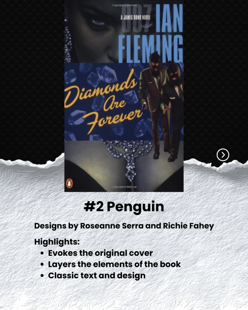
Penguin Modern Classics
Everything about this cover offends my eyes. The titles are too easily absorbed by the hideous blue filter.
It’s supposed to be a Las Vegas showgirl, but instead all I ask is why there’s a hooker on the cover.
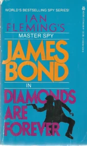
Berkley Paperback
This is boring. The entire run of these Berkly Paperbacks are bland silhouette of James Bond with a gun. Nothing highlighting the unique qualities or settings of Diamonds are Forever. It is generic in every way.

Harper Collins 2025 Editions
The entire collection of these Harper Collins editions are lazy as they can be. Nothing interesting in the design. Even the 007 on the page lacks excitement. They could have designed this cover on Canva.
I have seen many authors with a thirty dollar cover more intriguing than this one.
What do you think?
Do you have a favorite Diamonds are Forever cover?